
If you don’t know where to start, this can be a monumental chore. You can get carried away with tons of fancy design bells and whistles, but if you can just narrow things down for the consumer, it’s not that difficult at all. Here’s how you can optimize your pages by simplifying them, step-by-step.
Table of Contents
Step #1: Test and Optimize Your Page Speeds
The first step to creating a massively high converting page is to test your page speeds because 40% of online consumers expect a page to fully load in two seconds or less – this includes images, copy, product information, buttons… everything. If your pages aren’t visible almost immediately after clicking, site visitors will likely move away and many of them will never return. Correcting slow load time on a landing page can tremendously increase your conversion rate.
Luckily, you can leverage a free tool like Google’s PageSpeed Insights to easily check how long it takes for your pages to load. Just by entering the URL of your landing page, you will see approximately how fast your page elements appear on mobile and desktop browsers as well as potential optimizations to speed things up. If you don’t know how to “Minify CSS,” don’t worry – the tool will provide you with precise instructions.
Recommended reading: 8 Actionable Tips to Speed Up Your Website
Step #2: Make Sure Your Headlines are Compelling
Since this is the first thing readers see (often before they even land on your page), a compelling headline is your secret weapon for high conversion. So, the second step in optimizing your pages is to analyze your headline and subheadings. You need to give readers a reason not only to click through from online searches and social media posts, but also something to stay on the page for.
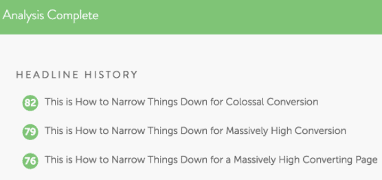
Understand that online readers are more likely to scan your page for relevant information rather than read it from start to finish. There are tools to help with this as well. My favorite headline tool is CoSchedule’s Headline Analyzer. The analyzer is designed for blog posts, but works well for all types of landing pages.
You simply enter your headline or potential headline into the tool (which is free in exchange for signing up) and the Headline Analyzer delivers a score with word balance and length review. According to CoSchedule, a balance of common, uncommon, emotional and power words tend to increase click-through rates, and the sweet spot for headline length seems to be around 55 characters that make up 7-9 words.
Recommended reading: 7 Proven Tactics to Create Shareable Content
Step #3: Include All Relevant Product Information
While headlines are the cornerstone of your page content, you cannot afford to stop there. Product descriptions, images, product reviews, product and shipping costs, and estimated delivery time are crucial components of a product page. I can’t tell you how many times I’ve moved away from a product or service website because I couldn’t find clear pricing. Be as detailed as possible when optimizing your product pages.
Luckily, there are tools to help with this as well. Shopify’s inventory management apps provide eCommerce stores with a way to simplify inventory management processes while including all relevant product information for online customers.
Your website visitor may not convert on the first landing page they arrive at. Around half of page visitors will use your navigation menu to orient themselves on your site. So, you want to uncomplicate the process in order to keep them hooked.
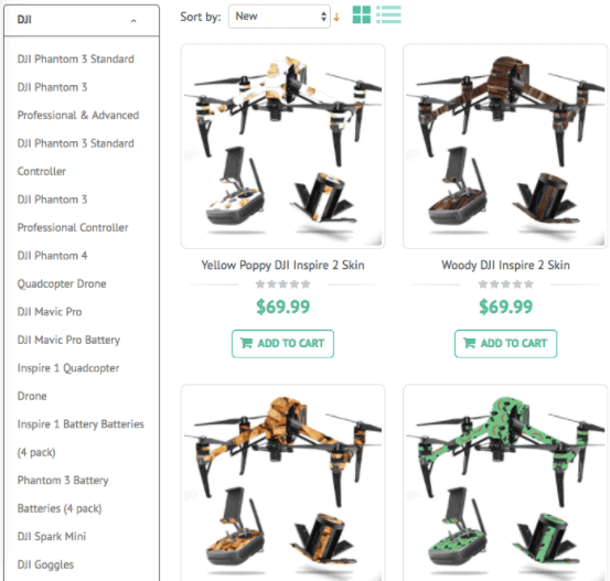
Since there is no one-size-fits-all approach to website navigation, you’ll have to design a structure that allows users quick access to the pages they need. For example, MightySkins sells vinyl skins for various devices. They have thousands of products in stock. Their DJI skins alone fall into 24 different categories. So, when a visitor lands on the page, they are given access to all of these categories in a side menu.
Whatever navigation menu style you choose, make sure it streamlines the conversion process.
Step #5: Include an Email Subscription Form
If all else fails, and a page visitor isn’t interested in your offer today, you always have email marketing to fall back on (as long as you’re willing to work at it). You should assume that the people who are willing to navigate away from your site might be interested in hearing from you again in the future. This means you’ll have to invite them to connect.
Yes, your page should include links to your social media profiles, and that might seem like enough. But, not everyone is going to want to like your Facebook page; those who do will end up seeing only some of your posts, especially with the implementation of Facebook zero. Eventually, all social media platforms are likely to follow-suit to facilitate more meaningful personal interactions and allow less organic reach for businesses. Learn to effectively build an email marketing list, use subscription forms throughout your website, and start seeing higher conversion rates.
Conclusion
Follow the five steps above to skyrocket your online conversion without redesigning your entire website. Do you have any simple tricks to help improve website conversion rates? Please share your insights in the comments below.
Liked this article? Please share it on Twitter using the link below:
[ctt template=”3″ link=”7YuEO” via=”yes” ][/ctt]
Related Articles


There is a huge huge difference between having what a lot of people would consider a “standard” eCommerce product page and a landing page to take your visitors to.
I have found you can increase the return from your top products by 2-300% by sending them to an actual sales page first even, and then onto a product page you can actually checkout from so that you can get all relevant information from so I agree with your assessment on #3 COMPLETELY.
Videos, good copy, and highly detailed specs can go a long long way here.
Corey Z.
Guaranteed PPC
Corey, Thanks for the thoughtful feedback. So, when you mention a sales page delivering the customer to a product page, does this tactic seem to work for an online store selling 100+ products, or just those selling a couple items? This is an idea I haven’t given much thought to, but you have my wheels turning.
-Ashley
[…] menu and including an Email subscription form can optimize landing pages for high Conversions, from Ashley Kimler’s […]
Nice to read your article. In addition, one of the best landing page best practice is minimizing the number of actions on the landing page. By removing extra form fields, navigation elements or other unnecessary functionality we can lead more traffic and more conversions. We would be surprised to see that a simple design with white space can make a site more user friendly.
Ah, yes Zubida! This is crucial. When people don’t have too many choices, it’s easier to guide them to the next step. Thanks for the reminder.
Thanks for the thoughtful feedback. So, when you mention a sales page delivering the customer to a product page, does this tactic seem to work for an online store selling 100+ products, or just those selling a couple items? This is an idea I haven’t given much thought to, but you have my wheels turning.
Hey Rana, excellent question! If you were selling 100+ products, I think it would be excessive to have 100+ sales pages directing readers to your products. However, using this tactic, I’ve seen stores successfully send website visitors to a handful of their core products and/or to target category pages.
Wonderfully explained, thanks
I’m glad I could provide value, Kevin! Thanks 🙂